
Background
The main aim of this post is to show how the Seaborn package can be used to simplify visualisation of statistical data.
The data and its corresponding visualisations tell a very important story, but this time I will desist from directly commenting on, or interpreting the story being told by the data, as this is a highly emotive subject.
Dataset
This dataset is a derivative of Reinhart et. al’s Global Financial Stability dataset which can be found online at: https://www.hbs.edu/behavioral-finance-and-financial-stability/data/Pages/global.aspx
The dataset will be valuable to those who seek to understand the dynamics of financial stability within the African context.
Context
The dataset specifically focuses on the Banking, Debt, Financial, Inflation and Systemic Crises that occurred, from 1860 to 2014, in 13 African countries, including: Algeria, Angola, Central African Republic, Ivory Coast, Egypt, Kenya, Mauritius, Morocco, Nigeria, South Africa, Tunisia, Zambia and Zimbabwe.
Acknowledgements
-
Kaggle Dataset (22 Nov 2019)
- Reinhart, C., Rogoff, K., Trebesch, C. and Reinhart, V. (2019) Global Crises Data by Country. [online] https://www.hbs.edu/behavioral-finance-and-financial-stability/data. Available at: https://www.hbs.edu/behavioral-finance-and-financial-stability/data/Pages/global.aspx [Accessed: 17 July 2019].
-
Kaggle kernel (22 Nov 2019)
Now, without further adieu…

Import Relevant Libraries
import numpy as np
import pandas as pd

import matplotlib.pyplot as plt
from pandas.plotting import register_matplotlib_converters
register_matplotlib_converters()

import seaborn as sns
sns.set('notebook')
sns.set_style('darkgrid')
Load data
raw = pd.read_csv('african_crises.csv', index_col='year', parse_dates=True)
display(raw.info())
raw.sample(3)
<class 'pandas.core.frame.DataFrame'>
DatetimeIndex: 1059 entries, 1870-01-01 to 2013-01-01
Data columns (total 13 columns):
case                               1059 non-null int64
cc3                                1059 non-null object
country                            1059 non-null object
systemic_crisis                    1059 non-null int64
exch_usd                           1059 non-null float64
domestic_debt_in_default           1059 non-null int64
sovereign_external_debt_default    1059 non-null int64
gdp_weighted_default               1059 non-null float64
inflation_annual_cpi               1059 non-null float64
independence                       1059 non-null int64
currency_crises                    1059 non-null int64
inflation_crises                   1059 non-null int64
banking_crisis                     1059 non-null object
dtypes: float64(3), int64(7), object(3)
memory usage: 115.8+ KB


None
| case | cc3 | country | systemic_crisis | exch_usd | domestic_debt_in_default | sovereign_external_debt_default | gdp_weighted_default | inflation_annual_cpi | independence | currency_crises | inflation_crises | banking_crisis | |
|---|---|---|---|---|---|---|---|---|---|---|---|---|---|
| year | |||||||||||||
| 1955-01-01 | 69 | ZMB | Zambia | 0 | 0.000714 | 0 | 0 | 0.0 | 3.571429 | 0 | 0 | 0 | no_crisis |
| 1984-01-01 | 35 | KEN | Kenya | 0 | 15.781300 | 0 | 0 | 0.0 | 20.667000 | 1 | 0 | 1 | no_crisis |
| 2001-01-01 | 56 | ZAF | South Africa | 0 | 12.126500 | 0 | 0 | 0.0 | 5.700000 | 1 | 1 | 0 | no_crisis |
- No missing data :)
- Mostly numerical data
Correlation Matrix
LabelEncoder
Let’s see if any of the features are correlated:
- Let’s first convert the non-numerical columns to numerical.
Enter: labelEncoder
numerical = raw.copy() # first, copy our raw dataframe
from sklearn.preprocessing import LabelEncoder
num = LabelEncoder()
numerical.cc3 = num.fit_transform(numerical.cc3)
numerical.country = num.fit_transform(numerical.country)
numerical.banking_crisis = num.fit_transform(numerical.banking_crisis)
numerical.head()
| case | cc3 | country | systemic_crisis | exch_usd | domestic_debt_in_default | sovereign_external_debt_default | gdp_weighted_default | inflation_annual_cpi | independence | currency_crises | inflation_crises | banking_crisis | |
|---|---|---|---|---|---|---|---|---|---|---|---|---|---|
| year | |||||||||||||
| 1870-01-01 | 1 | 3 | 0 | 1 | 0.052264 | 0 | 0 | 0.0 | 3.441456 | 0 | 0 | 0 | 0 |
| 1871-01-01 | 1 | 3 | 0 | 0 | 0.052798 | 0 | 0 | 0.0 | 14.149140 | 0 | 0 | 0 | 1 |
| 1872-01-01 | 1 | 3 | 0 | 0 | 0.052274 | 0 | 0 | 0.0 | -3.718593 | 0 | 0 | 0 | 1 |
| 1873-01-01 | 1 | 3 | 0 | 0 | 0.051680 | 0 | 0 | 0.0 | 11.203897 | 0 | 0 | 0 | 1 |
| 1874-01-01 | 1 | 3 | 0 | 0 | 0.051308 | 0 | 0 | 0.0 | -3.848561 | 0 | 0 | 0 | 1 |
Correlation
corr = numerical.corr()
corr
| case | cc3 | country | systemic_crisis | exch_usd | domestic_debt_in_default | sovereign_external_debt_default | gdp_weighted_default | inflation_annual_cpi | independence | currency_crises | inflation_crises | banking_crisis | |
|---|---|---|---|---|---|---|---|---|---|---|---|---|---|
| case | 1.000000 | 0.964105 | 0.990553 | 0.010991 | -0.231976 | 0.128358 | -0.039262 | -0.032981 | 0.044762 | 0.021858 | 0.095339 | 0.006405 | 0.023652 |
| cc3 | 0.964105 | 1.000000 | 0.946147 | -0.012692 | -0.312222 | 0.134268 | -0.082447 | -0.007799 | 0.048917 | 0.012709 | 0.090759 | 0.003644 | 0.041981 |
| country | 0.990553 | 0.946147 | 1.000000 | 0.015586 | -0.198953 | 0.155659 | -0.000455 | -0.041843 | 0.049184 | 0.013308 | 0.097166 | 0.016491 | 0.014667 |
| systemic_crisis | 0.010991 | -0.012692 | 0.015586 | 1.000000 | 0.202687 | 0.122158 | 0.249850 | 0.005274 | 0.106452 | 0.147083 | 0.112751 | 0.172562 | -0.853702 |
| exch_usd | -0.231976 | -0.312222 | -0.198953 | 0.202687 | 1.000000 | 0.005253 | 0.422890 | -0.040726 | -0.011947 | 0.126034 | -0.056472 | -0.063783 | -0.168775 |
| domestic_debt_in_default | 0.128358 | 0.134268 | 0.155659 | 0.122158 | 0.005253 | 1.000000 | 0.464751 | -0.029874 | 0.151832 | 0.109120 | 0.227585 | 0.224429 | -0.225797 |
| sovereign_external_debt_default | -0.039262 | -0.082447 | -0.000455 | 0.249850 | 0.422890 | 0.464751 | 1.000000 | 0.345919 | 0.072609 | 0.228192 | 0.199428 | 0.187930 | -0.263992 |
| gdp_weighted_default | -0.032981 | -0.007799 | -0.041843 | 0.005274 | -0.040726 | -0.029874 | 0.345919 | 1.000000 | -0.004535 | 0.078936 | 0.016970 | 0.017630 | -0.026545 |
| inflation_annual_cpi | 0.044762 | 0.048917 | 0.049184 | 0.106452 | -0.011947 | 0.151832 | 0.072609 | -0.004535 | 1.000000 | 0.016569 | 0.076590 | 0.080060 | -0.098860 |
| independence | 0.021858 | 0.012709 | 0.013308 | 0.147083 | 0.126034 | 0.109120 | 0.228192 | 0.078936 | 0.016569 | 1.000000 | 0.086376 | -0.022548 | -0.159620 |
| currency_crises | 0.095339 | 0.090759 | 0.097166 | 0.112751 | -0.056472 | 0.227585 | 0.199428 | 0.016970 | 0.076590 | 0.086376 | 1.000000 | 0.393376 | -0.166859 |
| inflation_crises | 0.006405 | 0.003644 | 0.016491 | 0.172562 | -0.063783 | 0.224429 | 0.187930 | 0.017630 | 0.080060 | -0.022548 | 0.393376 | 1.000000 | -0.235852 |
| banking_crisis | 0.023652 | 0.041981 | 0.014667 | -0.853702 | -0.168775 | -0.225797 | -0.263992 | -0.026545 | -0.098860 | -0.159620 | -0.166859 | -0.235852 | 1.000000 |
Matrix
Let’s invoke a heatmap for better visualisation of the correlations. This is a correlation matrix:
plt.figure(figsize=(20,20))
sns.heatmap(corr, cmap='coolwarm',annot=True, fmt='.2f', annot_kws={'size' : 18})
<matplotlib.axes._subplots.AxesSubplot at 0x1120cc240>
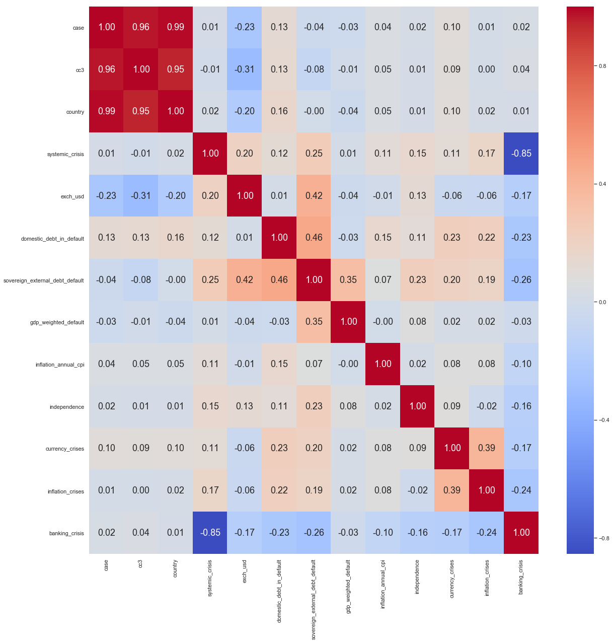
We see that the first 3 columns are highly correlated with each other. This is simply because they contain the same information. We will thus have to drop two and keep one as an identifier for country. For visualisation purposes, we will need the country name.
- Drop
caseandcc3as they contain same information ascountry - Textual data:
Country nameandbanking crisis: y/n.
However, when it comes to predictive analysis, we will have to either encode the country column, or instead use the case column, as it is already numerical!
For now, we go back to the raw variable, drop the case and cc3 columns and perform more EDA.
raw.drop(raw.loc[:,'case' : 'cc3'], axis=1, inplace=True)
Trends
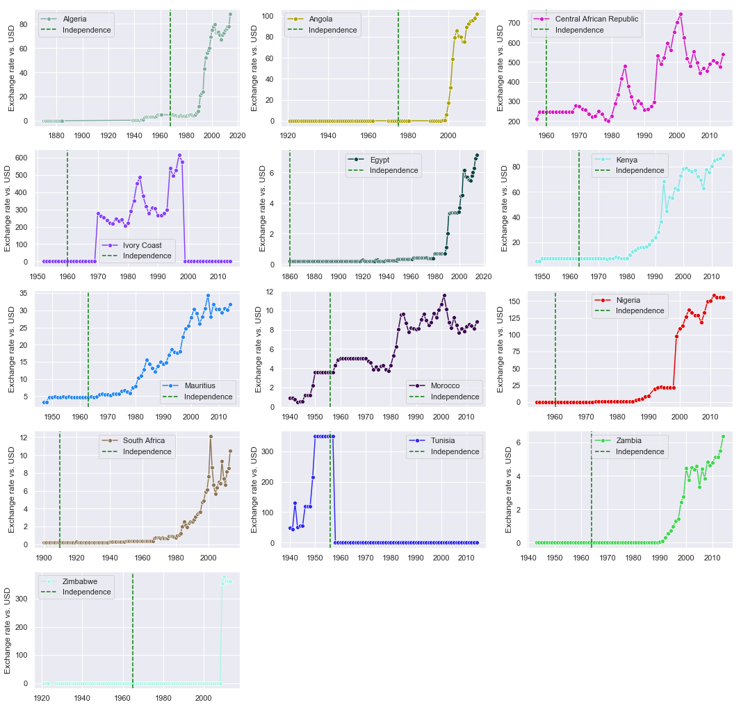
Exchange Rate vs. USD
The USD is a standard unit of comparison for a currency’s strength. We start by observing patterns, overtime, in each country’s currency exchange rate to the dollar
countries = raw.country.unique() # List of countries in the dataset

plt.figure(figsize=(18,18)) # create empty figure with these dimensions
plt.title('Currency exchange rate vs. USD over time') # title the plots
for ind, country in enumerate(countries): #index, country
    plt.subplot(5,3,ind+1) # add a plot box in the figure for each country
    exch = raw[raw.country==country].exch_usd # country's exchange rate to the dollar

    sns.lineplot(data= exch, label=str(country), marker='o', color=np.random.rand(3,)) # plot the trend
    plt.ylabel('Exchange rate vs. USD')
    # when did the country gain independence?
    independence = min(raw[raw.country==country].independence[raw[raw.country==country].independence==1].index)
    plt.axvline(independence, color='green', linestyle="--", label='Independence')

    plt.legend(loc='best')
plt.show()
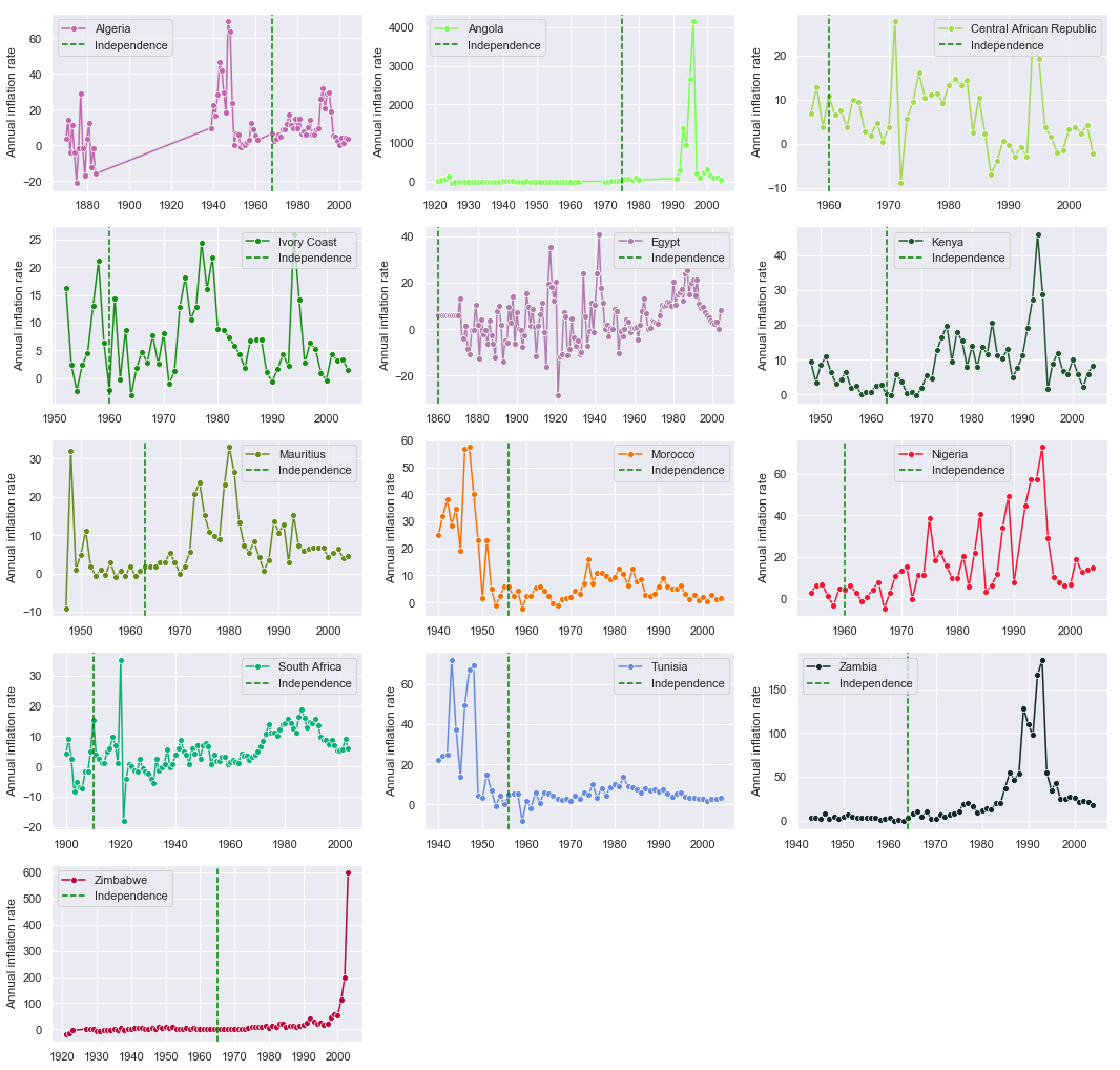
Inflation Rate
plt.figure(figsize=(18,18)) # create empty figure with these dimensions
plt.title('Annual inflation Rate') # title the plots
for ind, country in enumerate(countries): #index, country
    plt.subplot(5,3,ind+1) # add a plot box in the figure for each country
    infl = raw[raw.country==country].inflation_annual_cpi # country's exchange rate to the dollar
    sns.lineplot(data= infl[0:-10], label=str(country), marker='o', color=np.random.rand(3,)) # plot the trend
    plt.ylabel('Annual inflation rate')
    # when did the country gain independence?
    independence = min(raw[raw.country==country].independence[raw[raw.country==country].independence==1].index)
    plt.axvline(independence, color='green', linestyle="--", label='Independence')

    plt.legend(loc='best')
plt.show()
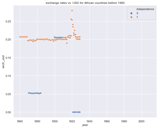
Average exchange rate vs. independence
plt.figure(figsize=(10,8))
rawn = raw.copy()
#rawn = rawn[rawn.gdp_weighted_default>0]
plt.title('exchange rates vs. USD for African countries before 1960')
rawn = rawn[rawn.index<'1930']
sns.scatterplot(x=rawn.index, y=rawn.exch_usd, hue=rawn.independence)
<matplotlib.axes._subplots.AxesSubplot at 0x1a2db26c50>
plt.figure(figsize=(10,8))
rawn = raw.copy()
#rawn = rawn[rawn.gdp_weighted_default>0]
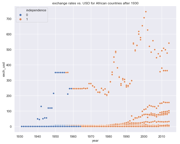
plt.title('exchange rates vs. USD for African countries after 1930')
rawn = rawn[rawn.index>'1930']
sns.scatterplot(x=rawn.index, y=rawn.exch_usd, hue=rawn.independence)
<matplotlib.axes._subplots.AxesSubplot at 0x1a2c518c50>
plt.figure(figsize=(15,15))
rawn = raw.copy()

#plt.title('exchange rates vs. USD for African countries 1860 - 2014')
sns.scatterplot(x=rawn.index, y=rawn.exch_usd, hue=rawn.independence)
plt.show()
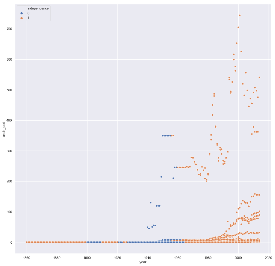
In general, we see that the value of an African country’s currency, on average, plummetted after independence, which generally occurred in the middle of the 20th century
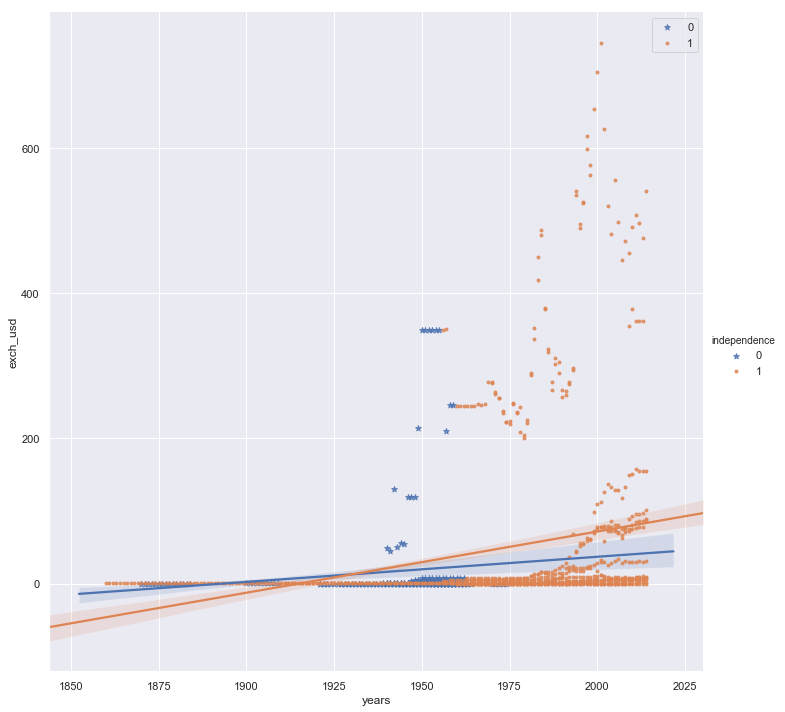
This is confirmed by the plot below, which shows a steeper rise in exchange rates after independence
rawn['years'] = [float(i) for i in rawn.index.year]

plt.figure(figsize=(60,40))
from matplotlib import rcParams

# figure size in inches
rcParams['figure.figsize'] = 21.7,40.27

sns.lmplot(x='years', y='exch_usd', hue='independence', data=rawn,
           markers=['*', '.'], height=10, aspect=1) #)
plt.legend(loc='best')
plt.show()
<Figure size 4320x2880 with 0 Axes>
sns.lmplot(x='years', y='inflation_annual_cpi', hue='independence', data=rawn,
           markers=['*', '.'], height=10, aspect=1) #)
plt.ylim(-100000, 100000)
plt.show()
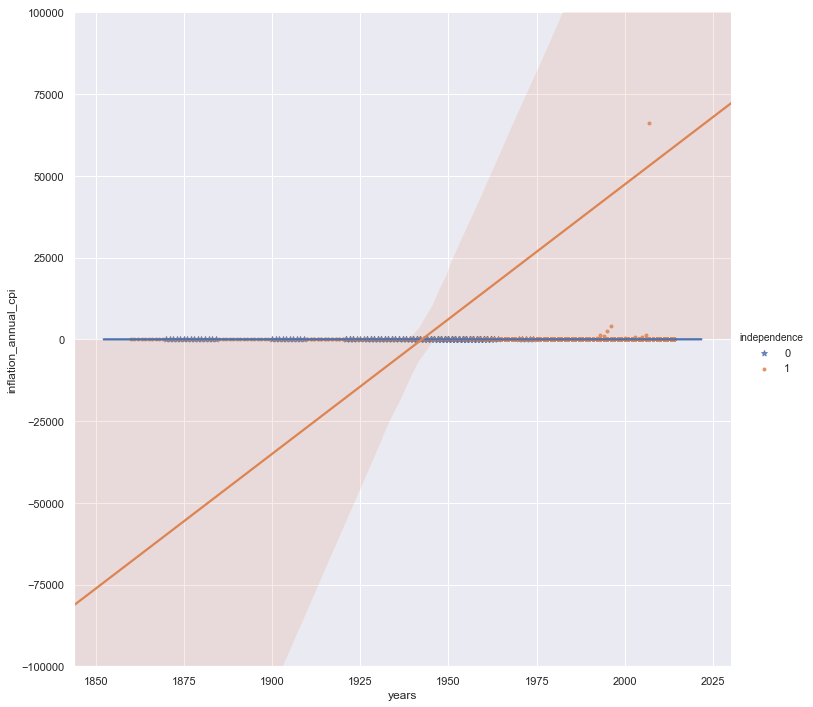
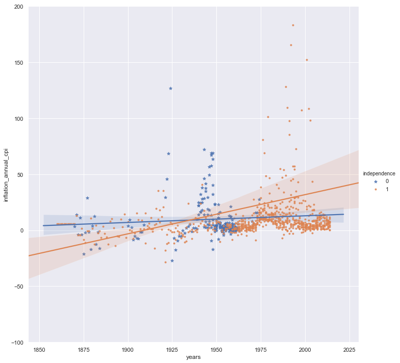
The annual inflation rates also illustrate this point. However, removing Zimbabwe from this analysis might yield a more sensible result:
rawz = rawn.copy()
rawz = rawz[rawz.country!='Zimbabwe']

sns.lmplot(x='years', y='inflation_annual_cpi', hue='independence', data=rawz,
           markers=['*', '.'], height=10, aspect=1) #)
plt.ylim(-100, 200)
plt.show()
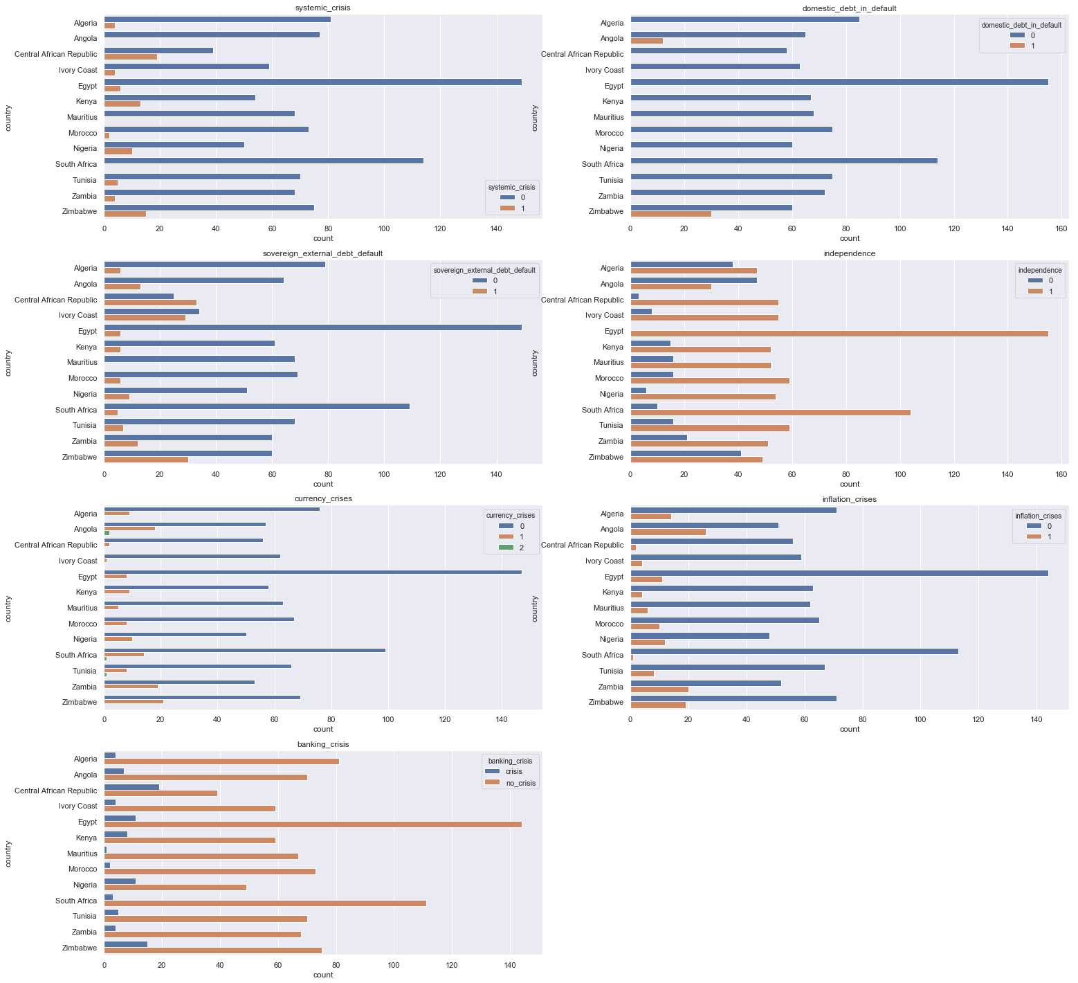
Crises and debt counts for each of the countries
counts = [raw.columns[i] for i,j in enumerate(raw.dtypes) if j in ['int64', 'O']][1:] # Non-continuous numerical columns (excluding Country)

plt.figure(figsize=(25,25))
plt.title('Debt and crises for each country')
for ind, count in enumerate(counts):
    plt.subplot(4,2,ind+1) # add a plot box in the figure for each country
    plt.title(count)
    sns.countplot(y=raw.country, hue=raw[count])
plt.show()
That’s all for now. Thank you for the read!